Composition
There are four types of composition; The Rule of Third, Layers, balance and Triangles. They are used to draw attention to certain objects in the image, and to make an image gripping.
The Rule of Third

|
|
Balance

|
|
Triangles

|
|
Layers

|
|
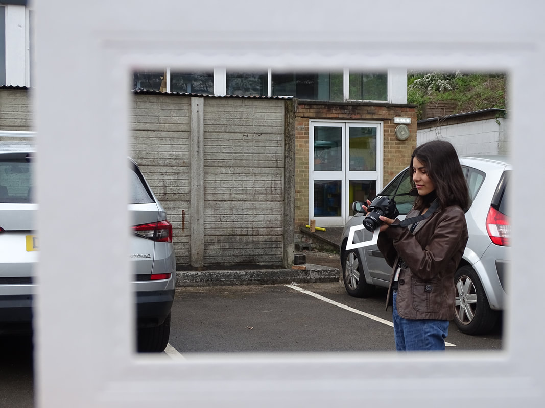
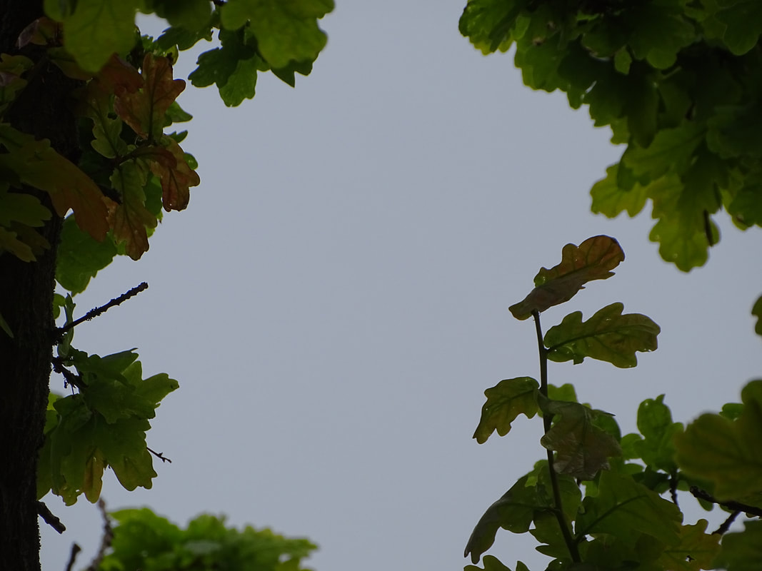
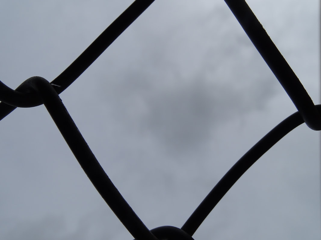
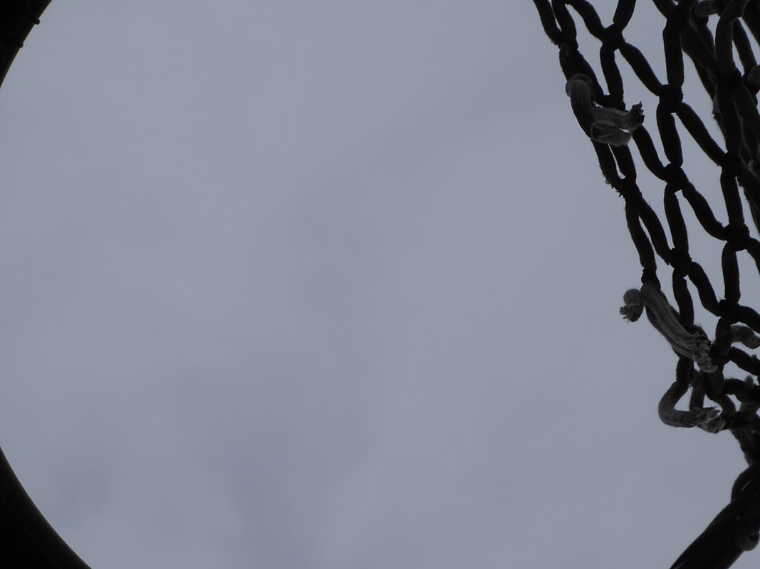
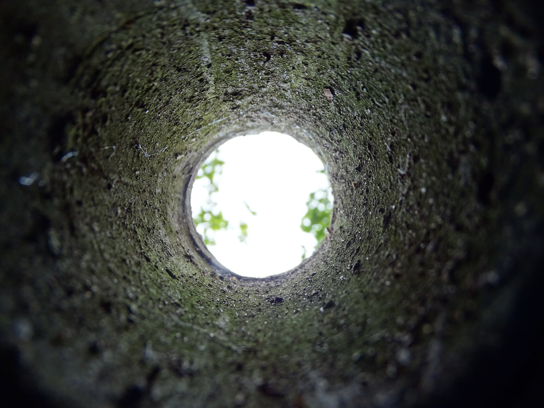
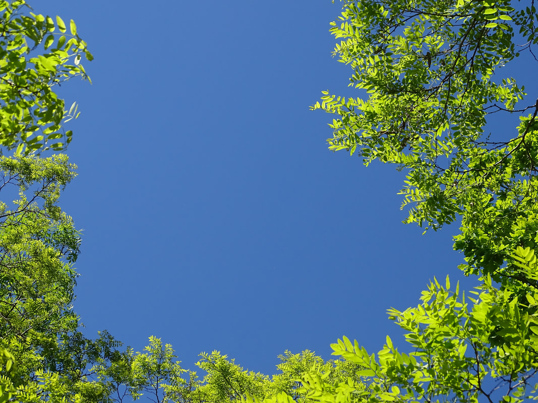
Framing the Environment
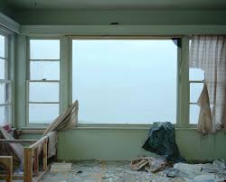
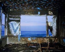
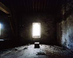
John Divola
John Divola is an American photographer born in 1949. He was born and raised in Los Angeles. He graduated with a BA from California State University in 1971 and got an MFA in 1974.
|
|

|
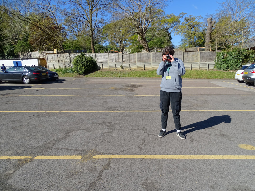
First response
|
|
|
|
WWW:
The focus on my subject was well accomplished. My response did frame the environment successfully, zooming into my subject. |
EBI:
I had created more responses of different objects, man-made and natural. If I had objects that were already made put into the environment s the frame, like John Divola's work that I placed above, would better my response. |
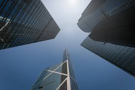
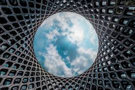
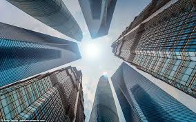
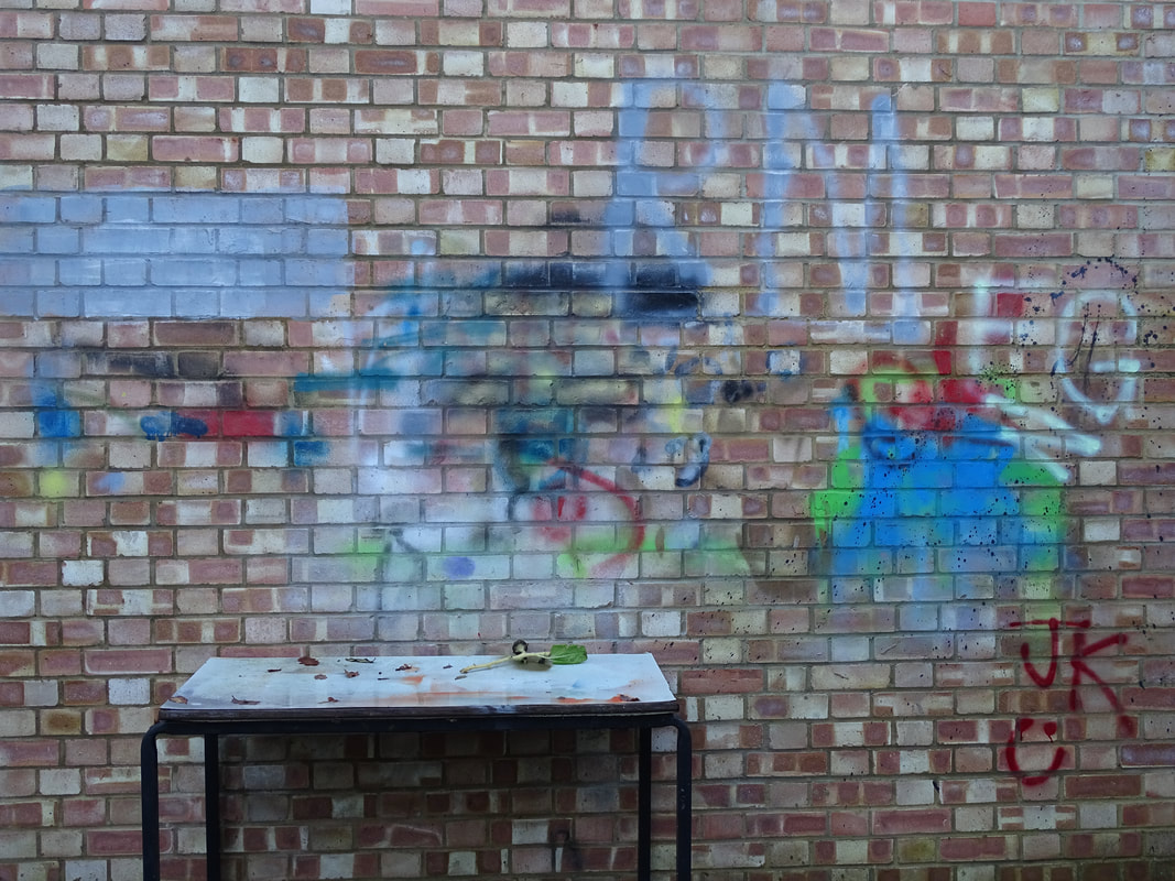
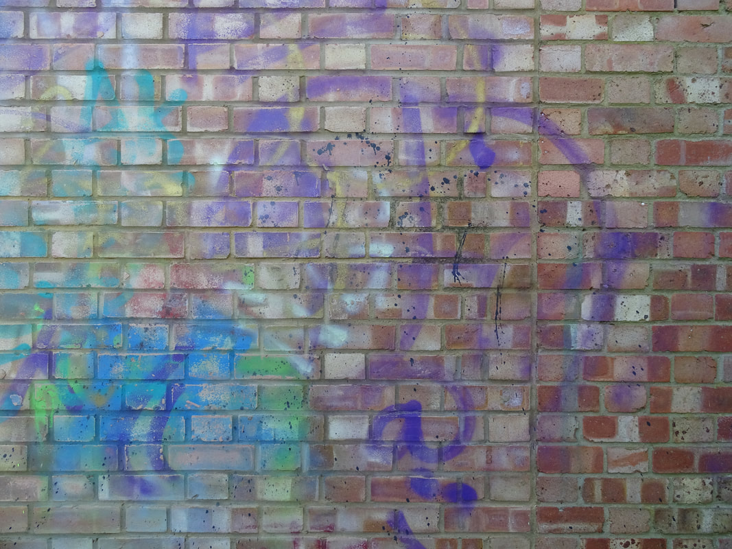
Andy Yeung
Andy Yeung is a young, successful photographer, winning numerous awards. Yeung focuses mainly on architecture, landscapes, arial photography. He was interested in photography at an early age, when his father gave him his old camera.
|
|
|
First Response
|

|
How to do:
|
|
First, you open photoshop.
Then, you press file, new and change the paper to international paper and from A4 - A3. Then press ok. After you should have a white section on your screen. Thereafter, press file, open and select the image that you would like to reflect then press open. You should then have that photo open on the white section on your screen. Then, press command t and edit the image to fit a quarter of the white section. Once you have done that press the curser control and then press apply. After that, drag on the same image onto the section and apply the same things as the original image, then reflect it. Do that as many times as you would like then |
|
WWW:
Creating a reflection of a colour and black and white one shows contrast which captivates the viewer. My edited image looks good as a result of good reflection, with the use of photoshop. My image looks intriguing to the viewers with the nice frame created by the reflection. |
EBI:
I had reflected a more interesting image, the colours of the sky were less saturated and made looking edited, and if I had reflected the image in a more interesting way. To further improve this, I should take photos of more interesting corners so when reflected the image creates fascinating sub-structures. |
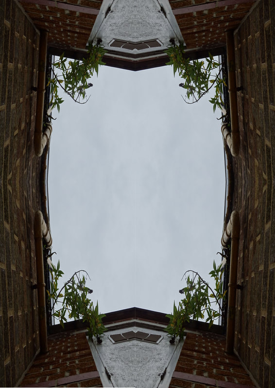
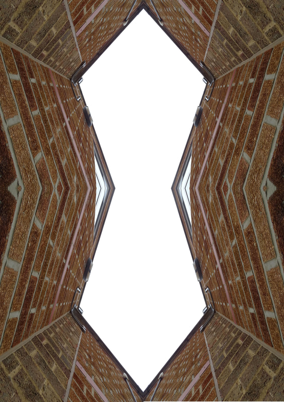
Second Response
|
|
|
|
WWW:
This response was better than my first response, as I took into my mind the improvements of the first response. I pictured interesting corners of buildings with bright colours formed by nature. The plants on the building create a captivating frame of the sky when reflected. |
EBI:
I reflected the corner more times to make the frame not just square but different shapes, to create a more intriguing image. |
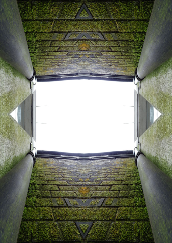
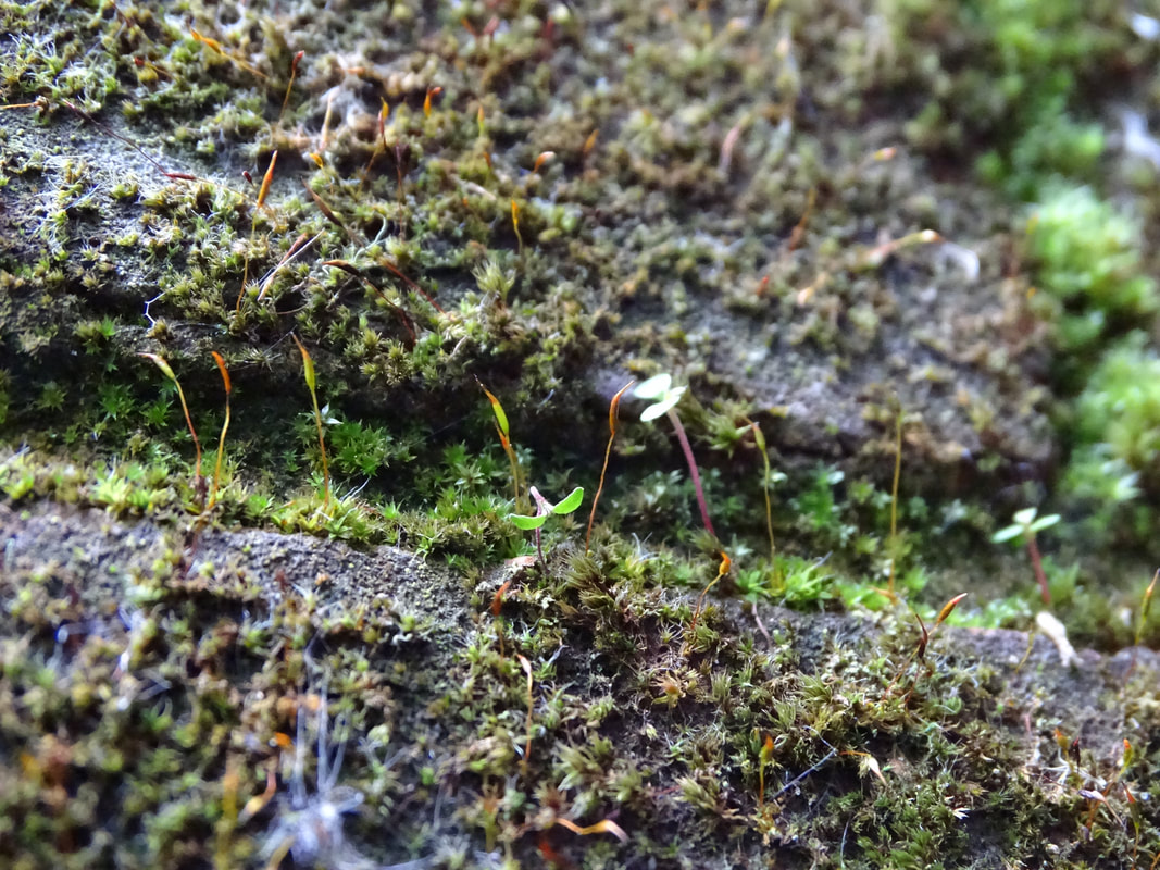
Natural frames
|
|
|
WWW:
I had improved my first response by applying my criticisms. I have shot an interesting corner including nature, emphasising the captivation and attractiveness of the reflected image. My natural frames create a new perspective of looking at nature, like the world's natural structure. This fascinates the viewer. |
EBI:
I can improve this response by taking more photographs and reflecting more to show how diverse each reflected thing can be. I can also shoot more natural framing. My last photograph of the natural framing section, the photo which focuses on the concrete brick, could be improved if my camera lens focused on the sky and the leaves. |
The Formal Elements
FOCUS/DOF
TEXTURE
CONTRAST
MOVEMENT
|
PERSPECTIVE
PATTERN

SCALE
TONE
|
LAYERS
NEGATIVE SPACE
COLOUR
BALANCE
|
School Journey
Focus


Colour


|
WWW:
I had managed to find different focuses, with an overall good lighting. The focus helps capture the viewers attention. I found lots of different colours from around the school. |
EBI:
For some of my images the lighting could be better by turning up my ISO. If I had a larger area to explore to find better areas to photograph. |
Home Journey
Texture


Focus


|
WWW:
I found beautiful nature outside of the school, with more of a variety of colours interesting the viewers. My focus responses were good, focusing on specific parts that I wanted and blurring the rest. I managed to find a broad range of textures which were taken appropriately so that when the pictures are viewed you can imagine the feel of each texture. |
EBI:
I had captured some images of texture on a say with different conditions, for example rain, because the same object on days with different conditions will have different textures to it, like a plank of wood - in the sun (as I had photographed in my response) will have a rough and splintery feel to it but when wet will feel different. |
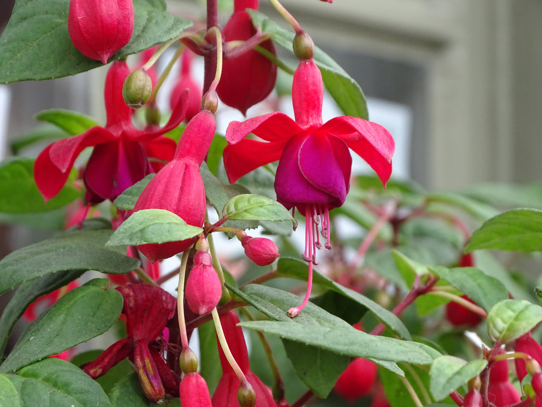
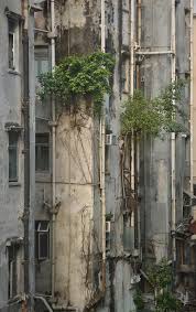
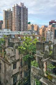
Wild Concrete
Romain Jacquet-Lagreze
Romaine Jacquet-Lagreze is a French photographer based in Hong Kong. He is well-known for his Wild Concrete collection. This collection represents the man vs. nature duality. Jacquet-Lagreze grew up in the suburbs of Paris, and worked and lived in Los Angeles , and Tokyo, but to him Hong Kong was special.
|
|

|
First Response


|
WWW:
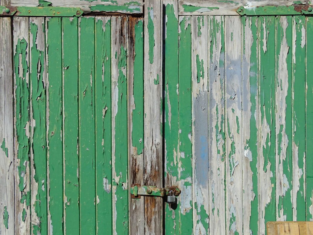
I had a good composition and well-thought ideas on where I should place the plant and what should be included on the photograph and what should not. The colours of the images make it look interesting, like the photo above this on the left with the green plant and rusty white pole. Also, the blue and green peeling doors. The peeling of the doors gives it the image a more natural effect. |
EBI:
I had the camera focused on the whole part of the flower and the lighting was better - by lowering the ISO - on some of my images. |
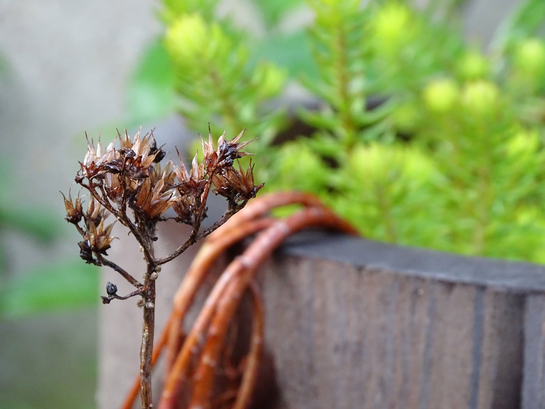
Second response


|
WWW:
These photographs were more exiting to look at as the plants were coming out of window sills, and other architecture. There was well-thought lighting decisions, my photo of the plant growing from the floor infant of the white wall with the sun shining on one side and not on the plant. That deliberate choice also creates a more pleasurable photograph. |
EBI:
Some of my photos were focusing better on the plant so that it can really highlight the nature Vs. man-made element. |
I really enjoyed responding to Romain Jacquet-Lagreze's Wild Concrete because I believe the representation of the beauty of nature and how it'll grow anywhere and never die out, is captivating.
Strata
layers


Stacking


Ripping


|
WWW:
I found the element strata in different and hidden places, like a part of a car, and the leaves of a tree. This highlights my creativity. I managed to find multiple areas of our school that have the ripping element. |
EBI:
I had more images responses for the elements. I had photographed strata in much more captivating places. |
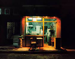
Strand 1
Gilles Coulon
Gilles Coulon was born in 1966. Coulon began his career photographing different facets of French society, under the supervision of the French daily newspaper Liberation. Coulons central themes were, the Paris Banlieue, precariousness at work and immigration. He is very successful, in 1977 he was awarded the World Press Photo First Prize in the "Daily Life" category.
I have decided to respond to Gilles Coulon because night photography engrosses the viewers. This really interests me as well as having one light in the night is captivating. I believe that it illustrates and portrays the night life and the sinister yet appealing view of it.
I have decided to respond to Gilles Coulon because night photography engrosses the viewers. This really interests me as well as having one light in the night is captivating. I believe that it illustrates and portrays the night life and the sinister yet appealing view of it.

|
|
|
My Response


|
WWW:
I have shot some interesting images, responding to the artist. I have created the aura of the darkness and that one light source. This captivates the viewers and draws their attention into the photograph. |
EBI:
I had taken some of my photos later when it was darker instead, highlighting the light from the shops and making that the only thing visible. |
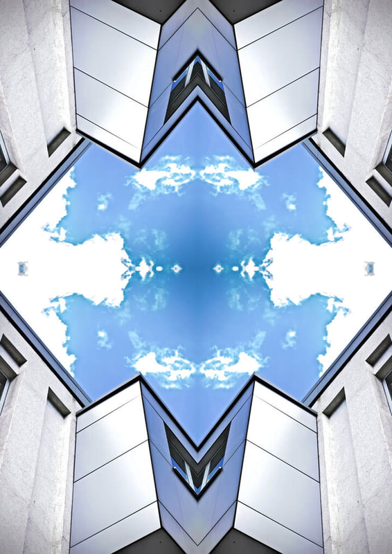
Strand 2
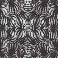
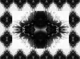
Horst P. Horst
Horst is a German-American photographer. Horst incorporated the influence that modernism and surrealism had on the art world into his photographs. Horst created these mirrored photographs in a collection called Patterns from Nature, in 1946. Horst photographed the detailed textures and forms of natural objects, including plants, rocks, shells and butterfly wings. His close scrutiny of these forms makes them unfamiliar and revelatory. He would further these images by simply reflecting it multiple times, creating kaleidoscope like images. Horst believed that these dynamic patterns would be ‘immediately applicable to industrial fields such as textiles, wallpaper, carpets, plastics and glass’.
|
|
|
My response
Original photo |
Reflected |

WWW: The reflected image turned out well because the original photo had good lighting and composition. When reflected it turned out interesting.
EBI: The image that I reflected was shot with the formal element focus so the flower was in focus but the stem was not and so when reflected it turned out a little blurry. Next time I can shoot the plant with all of it in focus. If I reflected the image multiple times I could make it into a kaleidoscope like pattern, similar to Horst P. Horst's. |

|
Original Photo |
Reflected |

WWW: I think that the reflected image turned out very interesting and captivating to the viewers because it looks like a floating ball of flowers intertwined. The blurred background spotlights the partially focused flowers. This draws the viewers attention. The darker tones in the edited image turned black and white creates a nice depth to the image. It also makes my response similar to Horst P. Horst's ones.
EBI: Again, the whole of the bundle of flowers were in focus and not just the front 2. If I had reflected the lowers on the outside as well creating a border, it would be more interesting, framing the flowers in the middle. |

|
Development 1
I developed this from Thomas Struth's black and white photos of broken down streets. I decided to keep the black and white element but develop it further to show the contrast of the streets off a rural town and the streets of an suburban town.
Streets of a rural town


|
Streets of an suburban town

|
|
WWW:
I successfully presented the contrast of the rural and suburban streets. In the first images the difference of the vehicles in the streets were really highlighted - in the rural town there was a big van with hay stacks on it, and in the suburban town there were big buses. My photos are in focus and shot in a good composition. |
EBI:
I had developed it slightly further and had slight faint pops of colour on certain objects. For example, signs of the shops or the nature. |
Development 2
I have decided to create black and white images with certain objects within the image in their colour. I came to this conclusion through my 2 other developed pieces. They are in black and white, and I like the old and slightly sorrow effect that black and white images connote, but I wanted to differentiate my final piece with my developed pieces a little bit - so I considered including certain objects in the image containing their colour, and the idea really appealed to me. I believe that the pop of colour really invites the viewer in and creates the photograph to be more gripping.

|

|
How to do:
|
|
First, you open photoshop. Then you open a photo the photo that you want to edit, into photoshop. Once the photo is open, press the [] and go up to press "Black & white", in order to add another layer of the photo but black and white. After that, you will need to make sure that foreground colour is black and the background colour should be on white. Next, press the brush tool, then right click on your screen and press the smooth brush. Then, zoom into the part of your photo that you would like to be coloured, and colour it! After that, press "File", "Save As...". Once pressed, you can change the name of the file as anything you want and save it too wherever. Make sure that you change the format from "Photoshop" to "JPEG". Finally, press save and you are done!
|
|
WWW:
My image was clear and in a good composition. The image turned black and white was very successful with the sky looking ominous creating an interesting feel of the image. I successfully turned the carriages back to colour, highlighting the carriages as the subject of my work. |
EBI:
I had created more responses that had a different setting allowing different emotion evoked. |
Development 3
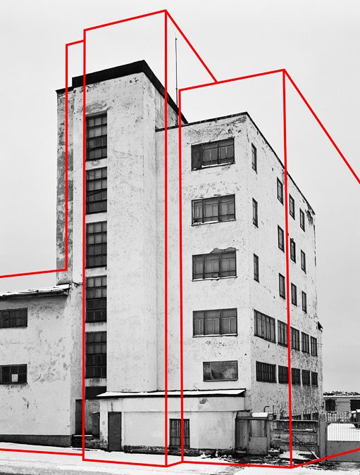
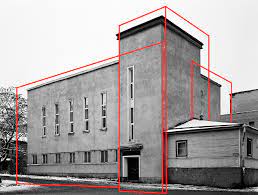
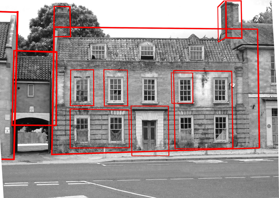
I am going to develop my response to Gilles Coulon by responding to Oleksi Bogolepov. I want to focus on the buildings in my hometown, and I found Bogolepov's work to be both captivating and intriguing. Bogolepov takes a brutalist turn on photography by capturing simple buildings and scoring the sides and edges with red lines, turning the viewers glance of the building as a whole to certain parts, in different perspectives.
Oleksi Bogolepov
|
|
|
First response
|
WWW:
My image is in black and white with red lines highlighting certain structures of the building. The emphasis on the structures of the structures of the building isolate its features presenting different perspectives of the building to the viewers. |
EBI:
If the image was straight and not tilted and if my red lines were all the same thickness, then my image completed image would be a lot better. If I had used a longer building or a builder that didn't take up the whole width of the frame then the framing of the building would improve. |
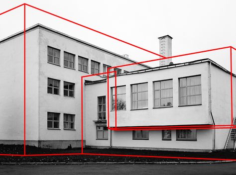
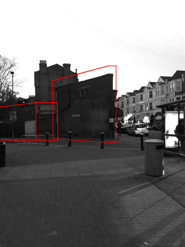
Second response
How to do:
|
|
First you upload the image of the building you took onto photoshop. Then, using the "polygonal lasso tool" make thin lines that you can then press "edit" "fill", change use to "colour", select red then press "ok". Now you have a filled in red line. Do this step multiple times around any of the edges of the building you would like to trace. Once you have completed all the lines, turn the image black and white by pressing the "black and white" square in "adjust". Your image should turn black and white. Next you press the arrow next to the smaller black and white boxes. Then, select the "pen" tool and change the e to the first circle at the top, and change the size to 100px and the hardness to 50%. Next you trace over the lines with the pen changing them into colour, back to red! If you colour anything apart from the red lines then you can rub it out using the "rubber" tool. Once you finish painting over all the lines, save your image, and you are finished!
|
|
WWW:
I have improved the mistakes that I made in my first response: I made thickness of the red lines even throughout the all the lines, and my photograph of the structure is well centred in the frame. My structure does not take up the whole width of the frame allowing a well structure of red lines to be built around it. |
EBI:
My image was taken earlier in the day allowing the whole image to be lighter, like Oleksi Bogolepov's buildings, with a lighter sky around. The lighter sky and and surroundings would avert all attention to the building, due to the contrast, which is what I want. |
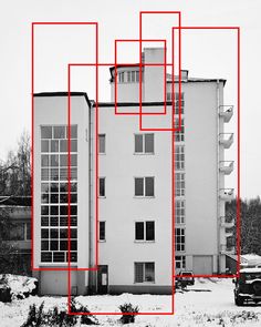
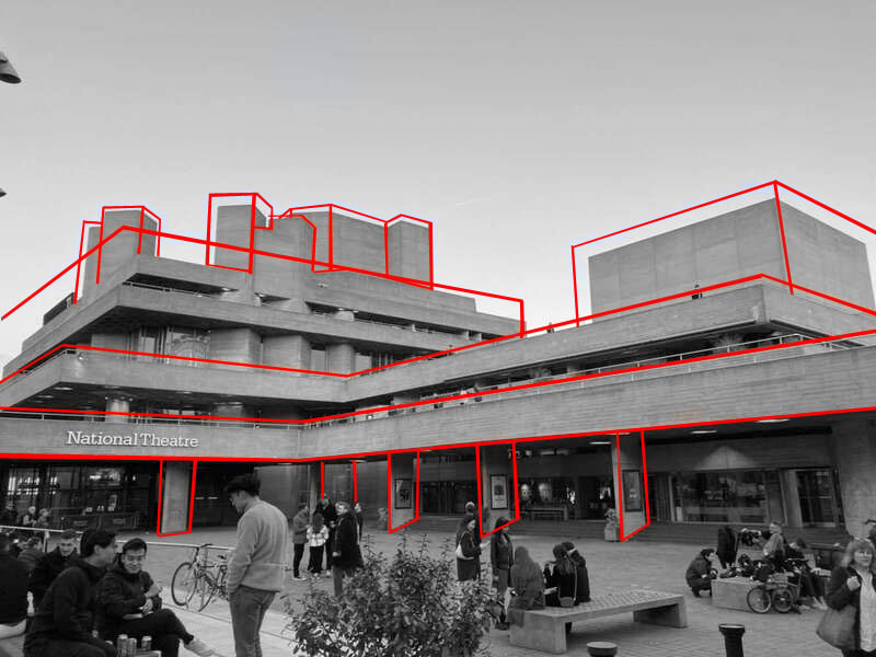
Third response
|
WWW:
My photograph was straight and in focus creating the edited image to be captivating. The red lines highlighted the features of the National Theatre successfully. This building choice was good because of the interesting lines and shapes this building is architected from. |
EBI:
There weren't people in the phrame in front of the building because it took away the isolated element, and blocked parts of the building that could have been lined. |
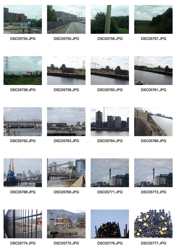
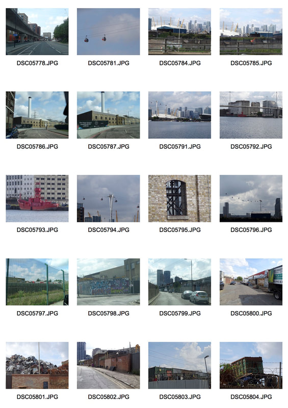
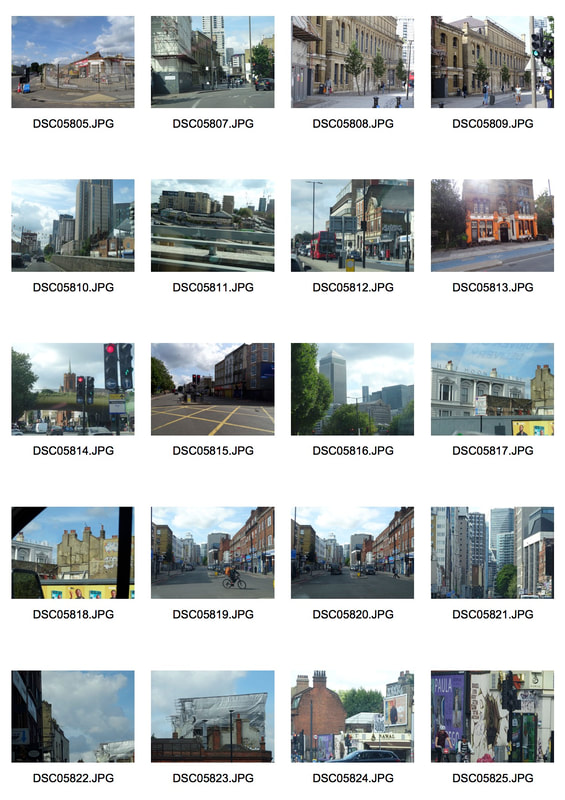
Final Piece
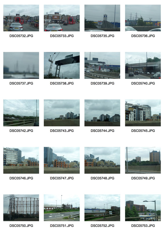
My final piece is developed from Thomas Struth's black and white images of broken down streets in Germany to black and white photos of the industry world in London, and Nico Goodden's images of London. I have added my own elements by turning teh focus to south London to capture the dying industrial world.
Intent
I decided to photograph the industry world in London in black and white for my final piece because I find the difference of the same world but in a different time very interesting. The late 1700s when the Industrial revolution was happening the industrial world of London was booming but now to see it as scraps and not the highlight of London is very interesting. I have decided to capture this in black and white to present Industrial London as the past and now to be slowly dying, and forming somewhere else. All of Canary Wharf and New ham used to be packed with factories and offices but now majority have been converted into flats and others abandoned.

|

|
|
|
|
WWW:
I have successfully taken black and white images of industrial buildings. My composition is good, having the image photographed straight on portraying all of the industrial buildings. I have managed to capture old and new industries, creating a range of photographs. |
EBI:
I have found more rundown industries to capture. Next time, I would want to have a better view of the new industries so that I could portray the difference in the old and new. In the new, it was quite busy with lots of people and in the old it was quite abandoned and isolated. |
The Final Piece Images


|


|


|

Click here to edit.

|
